Vention
Headquartered in New York, with 20+ offices and 3,000+ developers worldwide, Vention helps leading companies accelerate their product vision and scale tech operations. To match the growing influence and sophisticated client base, the company initiated a global rebranding process. Learn more on the rebrand
Brand Identity
Design System
UI/UX
The company wanted to revision its name and identity to change positioning, and stand out in a crowded market of B2B software development studios.
It had a different name and visual style, and C-level stakeholders wanted a complete overhaul. To match the company long-term strategy, our Brand team partnered with Pentagram, the world’s largest independent design consultancy, to shape the foundational elements and adjust brand presence across all touchpoints.
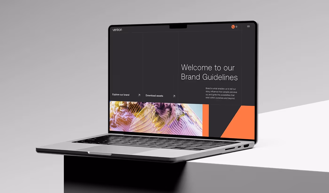
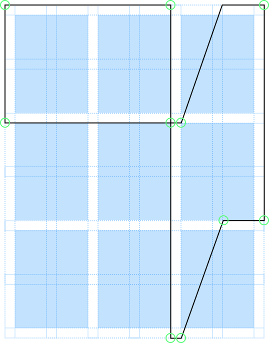
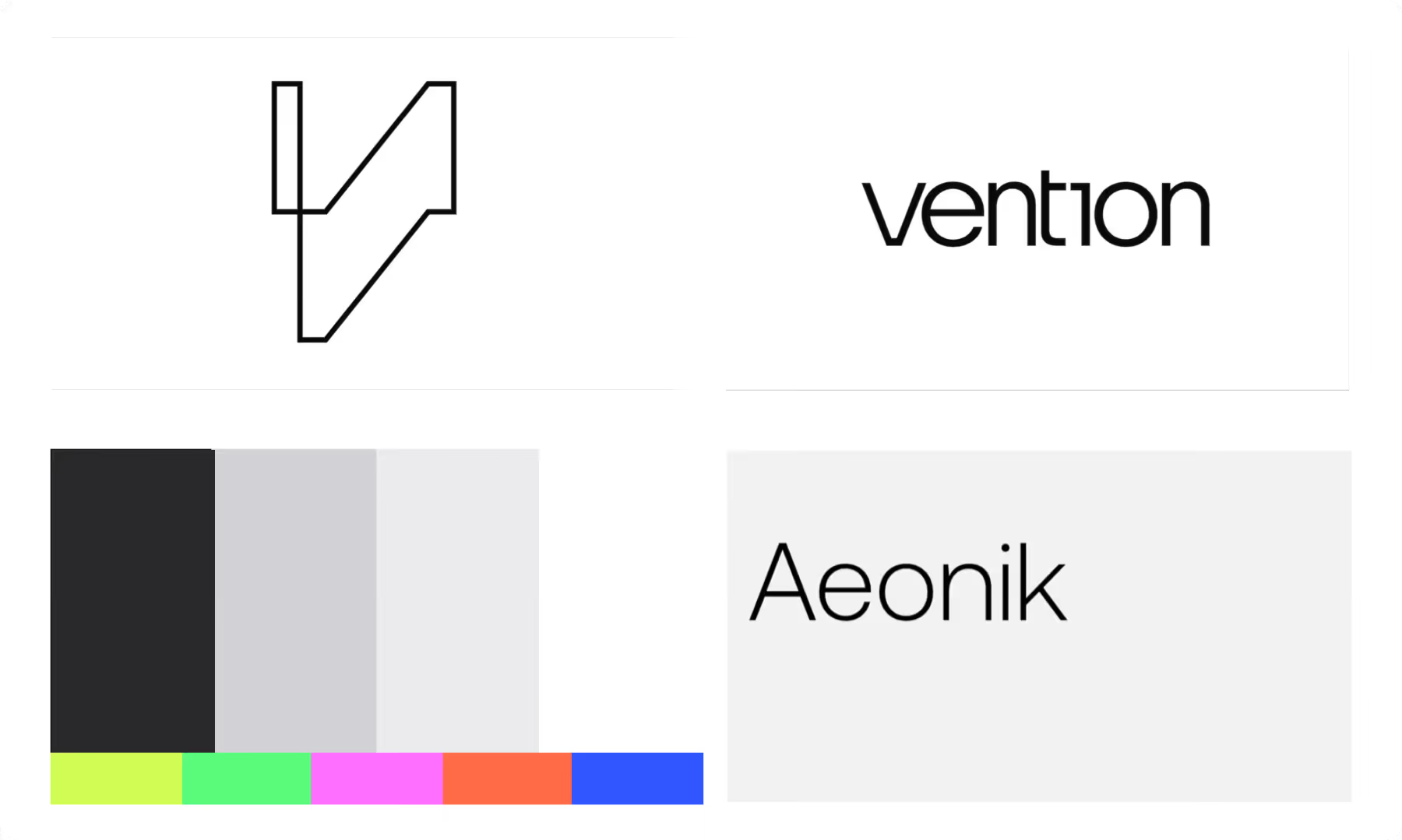
In the brand design approach Pentagram honored the dynamic geometry at the core of the new identity. The visual system is based on a ‘Dynamic V' (V for Vention). The shape can be reconfigured to any given layout, using the flexible grid system.
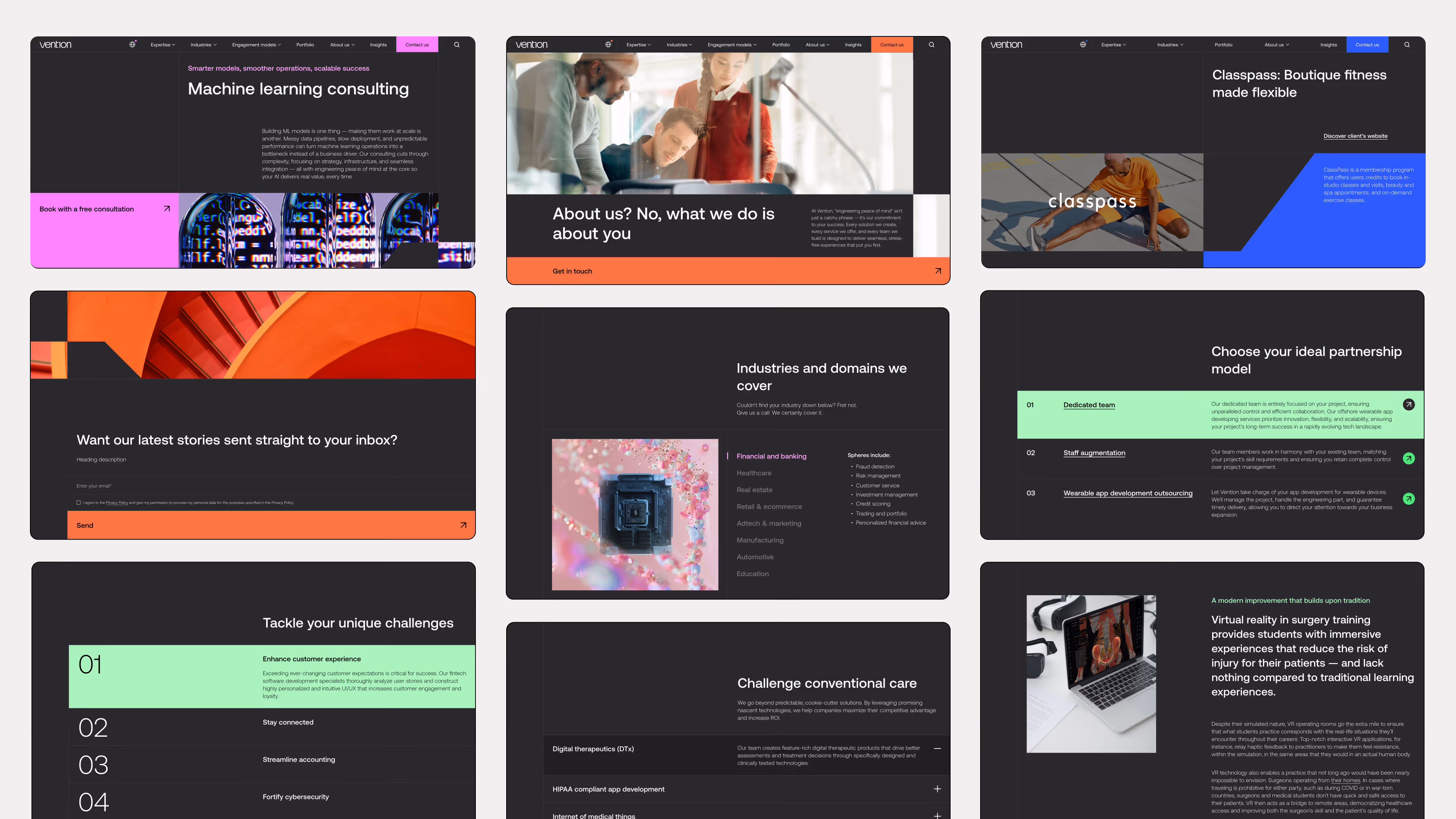
This geometry principle was applied to website design approach as well, as a dictinctive graphic feature in layout design.
As the brand direction was settled, our Design team began translating the new vision into digital and physical presence, starting from the basics: logo and color usage, grids, proportions and typography conventions.

As a UI/UX designer, I contributed by doing the heavy part of the digital implementation:
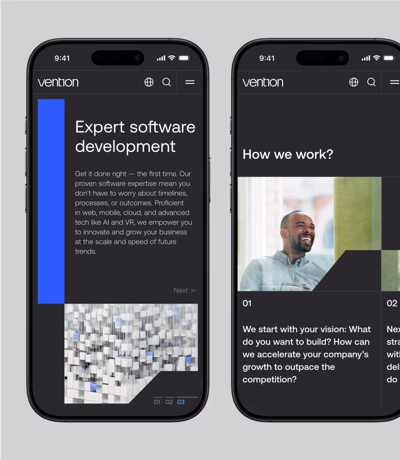
- Developed a Design System by refining components, grids, typography, and color usage for the website
- Designed reusable website building blocks (desktop and mobile), and systematised them in a library
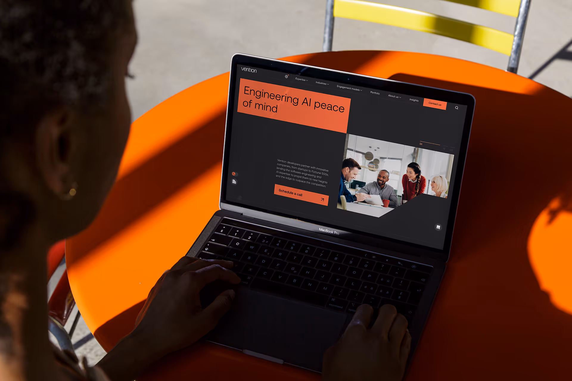
- Redesigned website pages and features like service pages, contact page, blog, and careers website.
I built and governed a centralized Figma design system to show UI states and color modes, created documentation for dev team, and established system ownership. These actions improved consistency long-term and reduced design-to-development time by enabling faster page production and fewer repeated UI decisions.
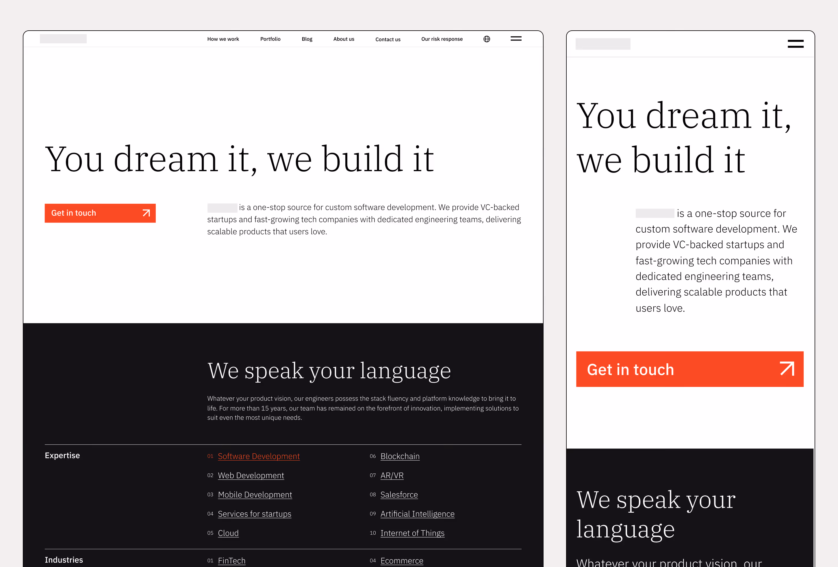
In order to enable a quick rebrand rollout online, the design team had to scale production of pages while keeping design integrity across a large platform.
That's why we delivered a library of reusable website building blocks. This library created to be scalable, and enabled creation of new layout modules later. It helped designers to speed up the process of creating new pages and refurbishing old ones.
I collaborated with engineering to translate Figma modules into reusable CMS components. Developers built modular CMS block system so admins could construct and publish pages from design-aligned blocks.
As a result, this system enabled rapid redesign and creation of pages, and accelerated ongoing content delivery. In the initial phase of pushing forward the new identity we delivered a 200+ pages website overhaul within a tight timeframe of 2.5 months.
200+
pages were redesigned for the rebrand launch
55+
revisioned layout modules were created
2.5
months for a complete website overhaul
Homepage
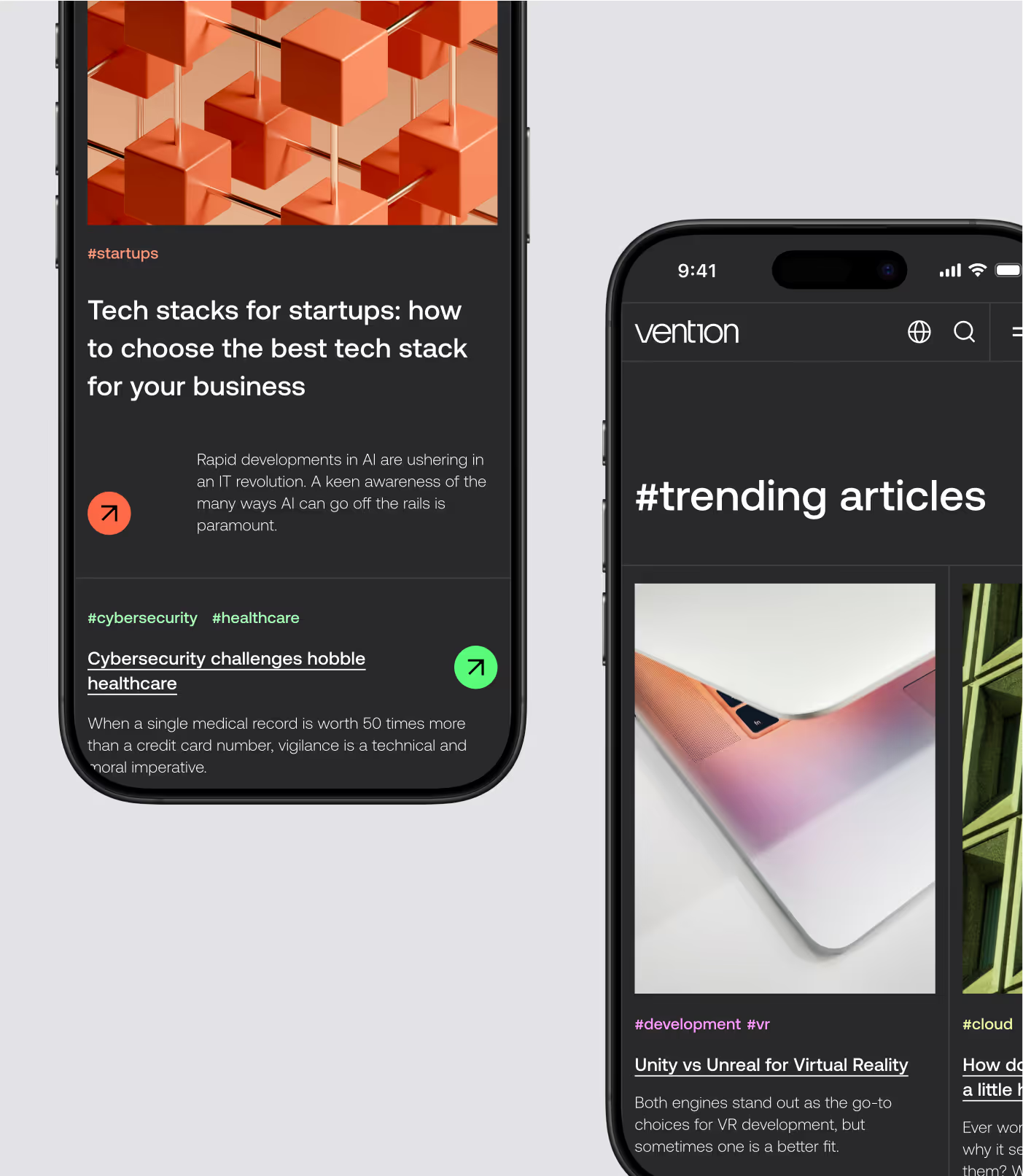
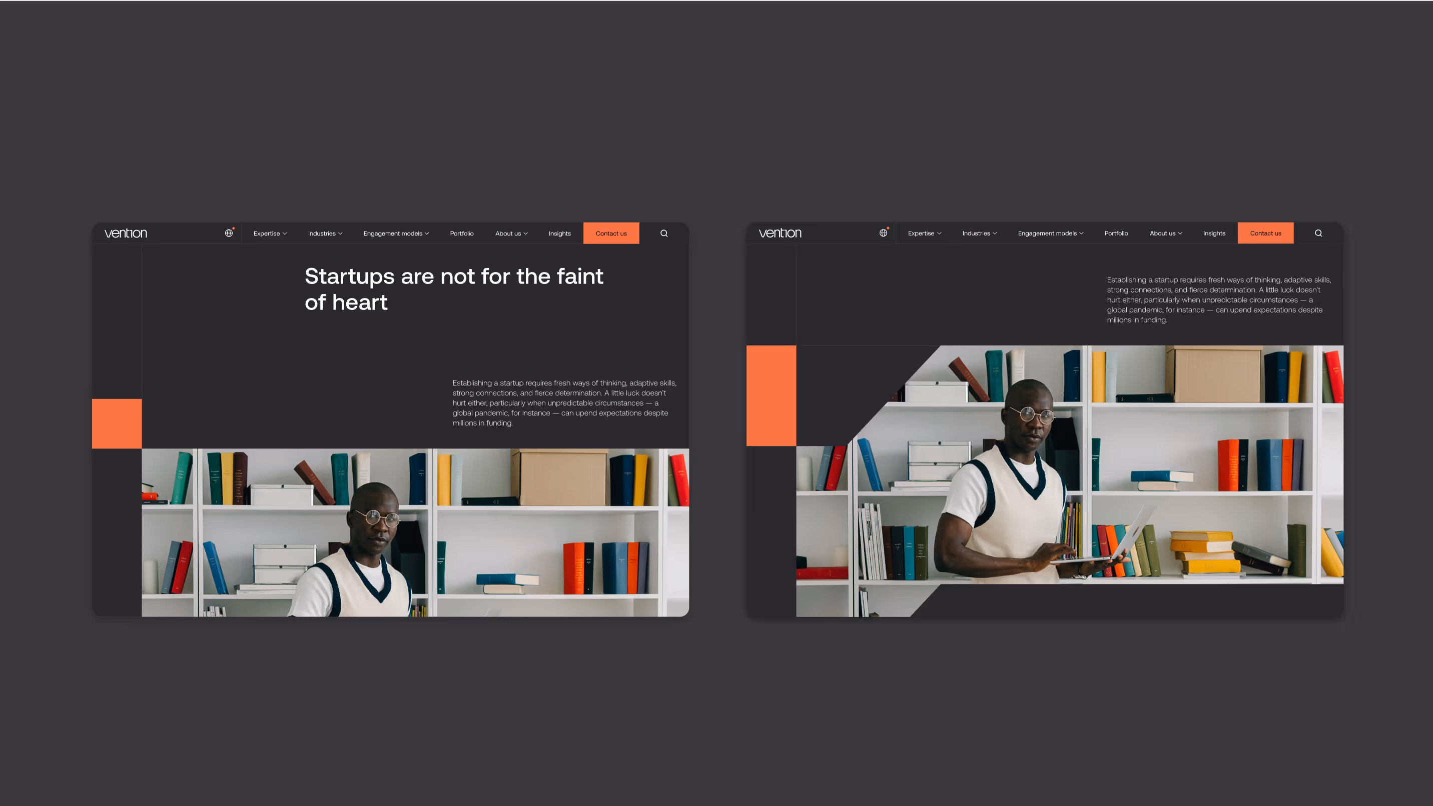
Blog article page
Vention website and digital campaigns earned several Honorable Mentions from Awwwards for their design and execution, and also gained recognition from Webby, Readymag and Mindsparkle.


Blog pillar page
After the rebrand release, I delivered UX updates by creating more intuitive, user-friendly interfaces
and customer interactions to increase website-driven leads by improving trust and reducing friction in lead-capture journeys. Updates were based both on hypotheses and user testing results (such as interviews, A/B testing, and site analytics). That included boosting website navigation, optimising layout efficiency, iterating on contact forms and pricing calculator, and more.
I closely collaborated with a development team to ensure consistency, always being able to consult on a technical part of the design implementation.
Also, I teamed up with engineers on designing an internal knowledge base for employees on SharePoint platform, and built landing pages and interactive reports on no-code platforms such as Readymag and Webflow.

One of my favorite UX challenges was navigation revamp project that came after testing the initial navigation panel. User interviews and heat maps showed low engagement with the menu content and confusing UX: users struggled to find specific services for certain industries. Analytics showed a higher number of U-turns than expected, which also signalled confusion. Also, layout didn’t allow for effective SEO development, and mobile navigation improvements were much needed too.
My task was to improve services discoverability and reduce confusion across main site and industry microsites where users struggled to understand scope and hierarchy.
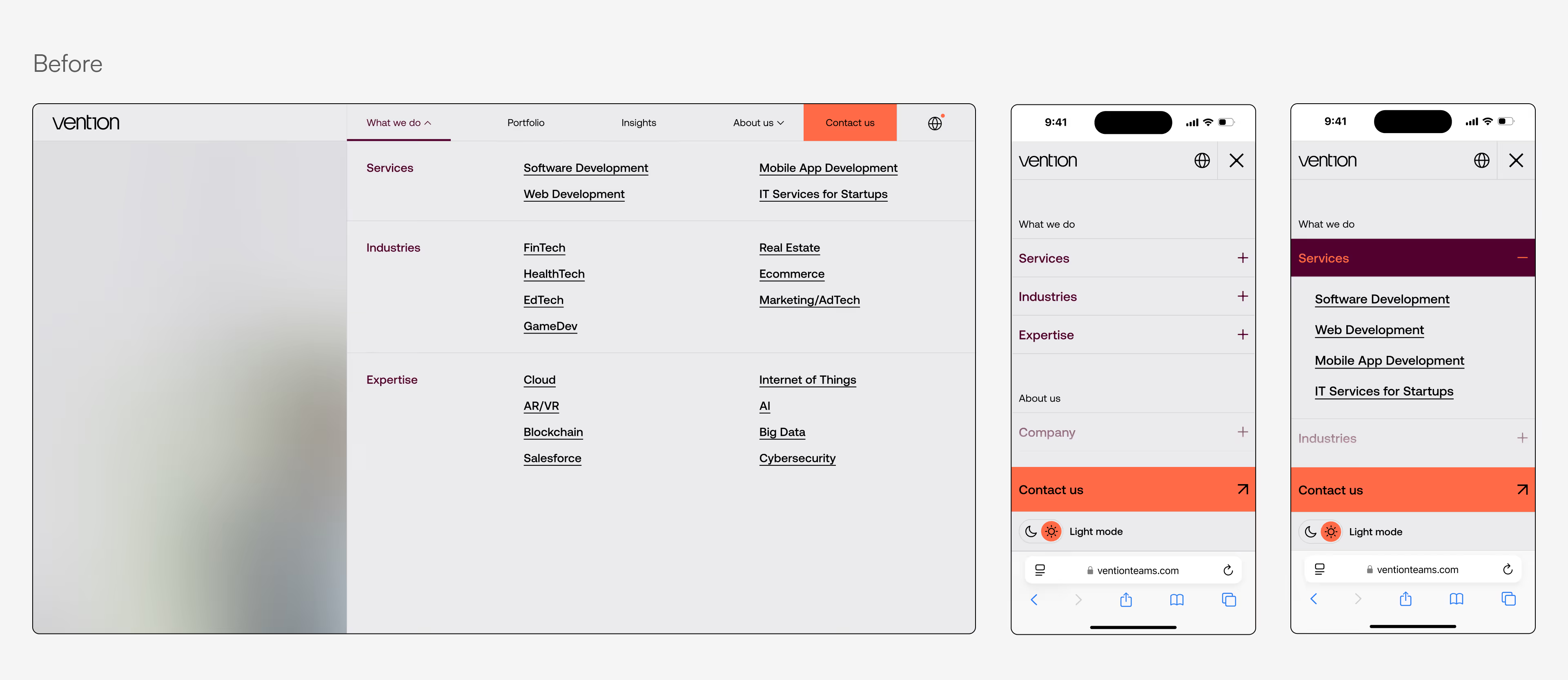
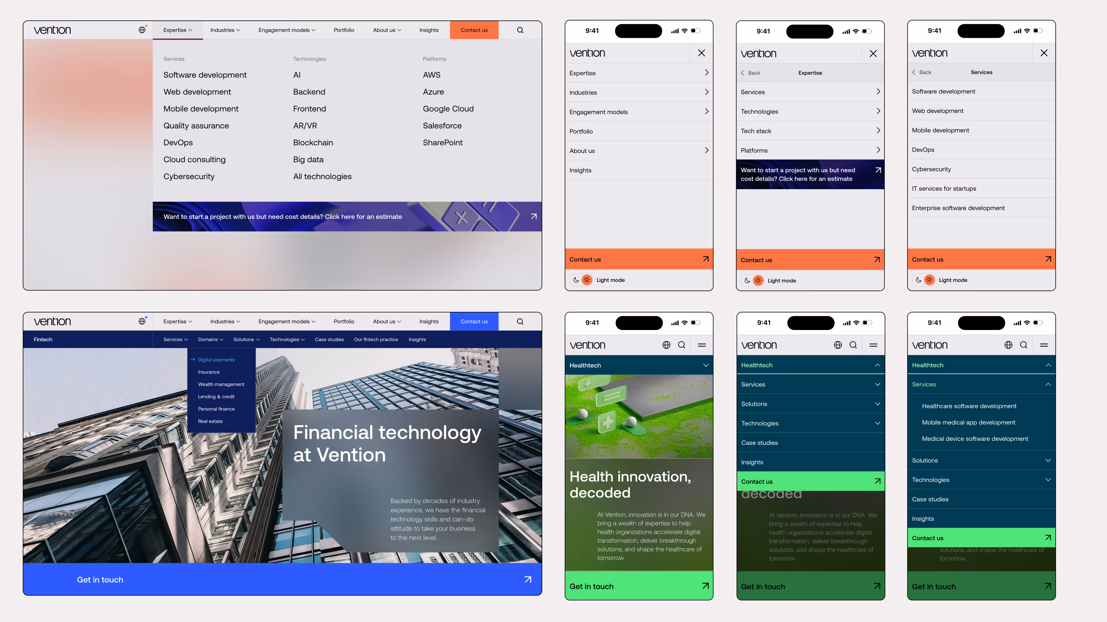
I restructured the information architecture in partnership with the SEO team, redesigned the global menu, introduced website search, and created distinct subnavigation panels for industry microsites.I was responsible for communication with developers on implementation, and delivered design quality assurance until the final project release.These actions increased navigation interactions, indicating stronger pages exploration, and highlighted high-intent pages (services, pricing calculator, contact page).
Desktop interactions
↑ 12.7%
Users clicked on Menu
↑ 10.1%
Total Menu clicks
Mobile interactions
↑ 20.8%
Total users
↑ 16.8%
Users clicked on Menu
↑ 5.6%
Total Menu clicks
To ensure long-term brand consistency, our team designed a custom brand portal — a centralized hub for guidelines, templates, and assets — enabling seamless adoption across global offices.
Beyond functionality, we prioritized interactivity, allowing users to play around with typography, color combinations, logo scaling, and more — making the adoption process smoother and more engaging.